SARAH JESSICA PARKER
Jon Dinapoli, JMD, Founder has workd with America’s favorite fashion icon, Sarah Jessica Parker, since 2006, where they launched the original Lovely at Coty together. JMD continues to partner with Sarah Jessica on all of her fragrance and beauty endeavers.
- Brand Identity
- Packaging
- Art Direction
- CAMPAIGN
- CONTENT CREATION

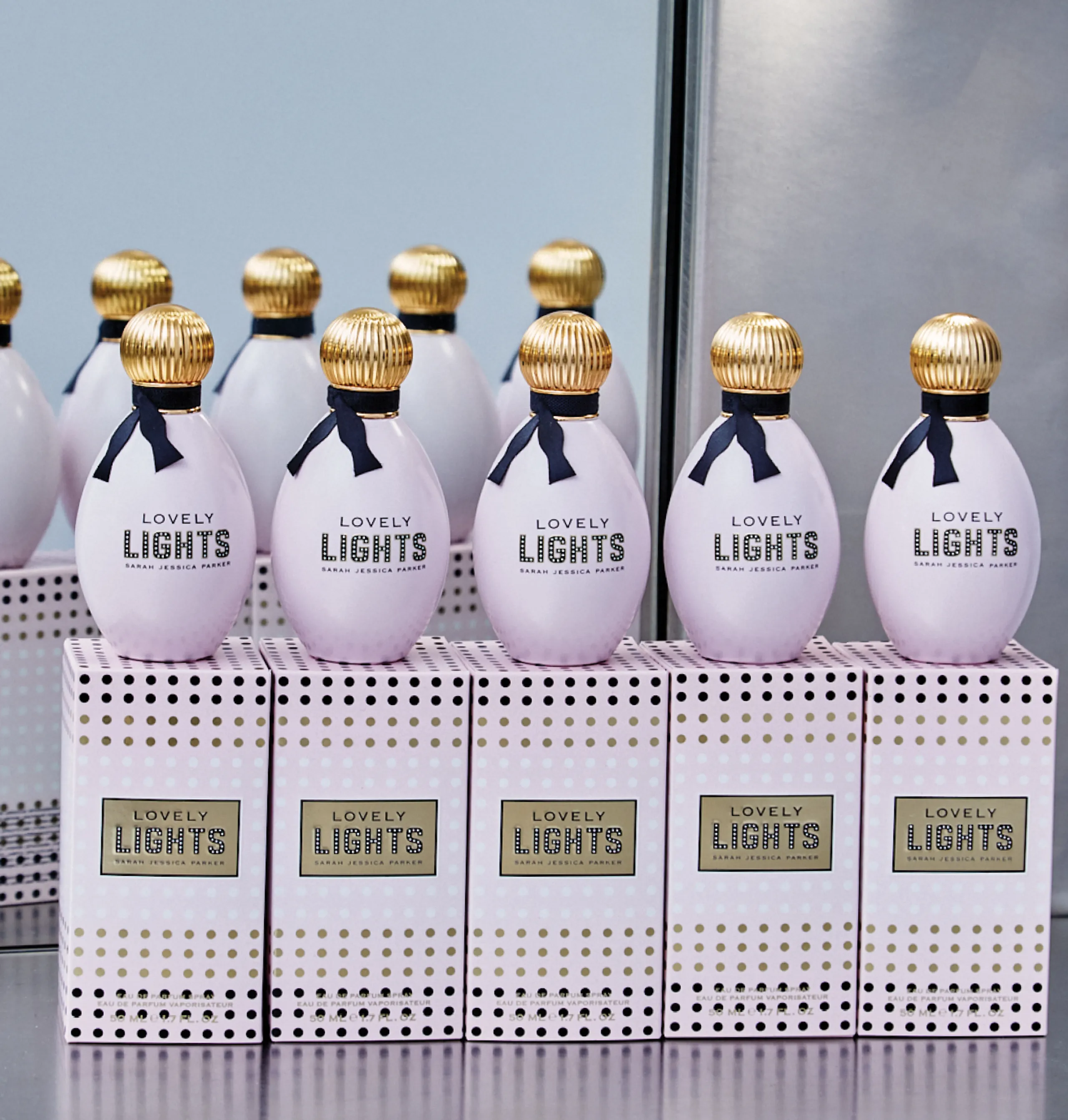
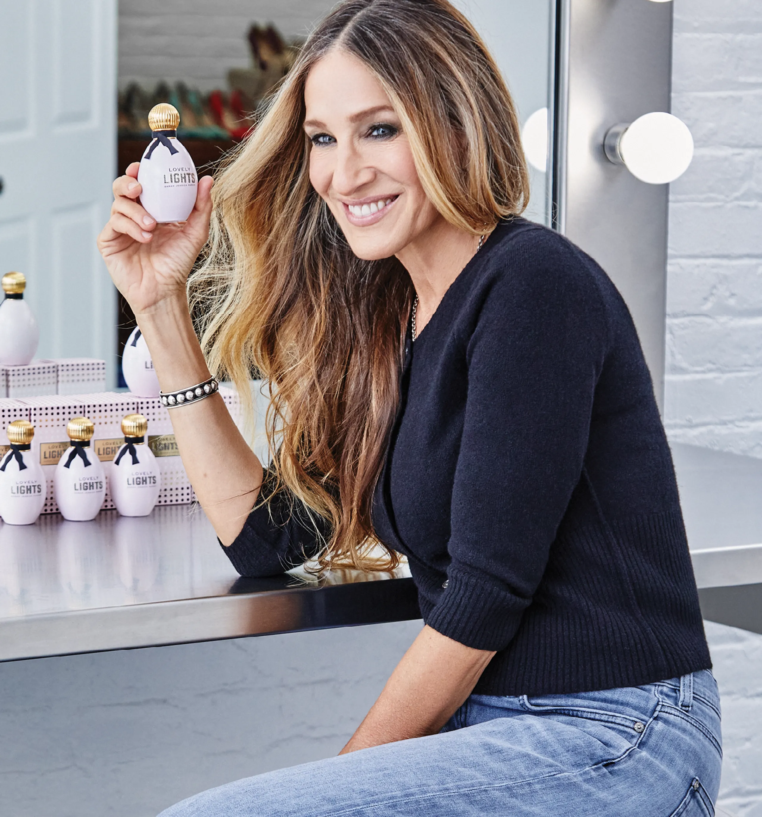
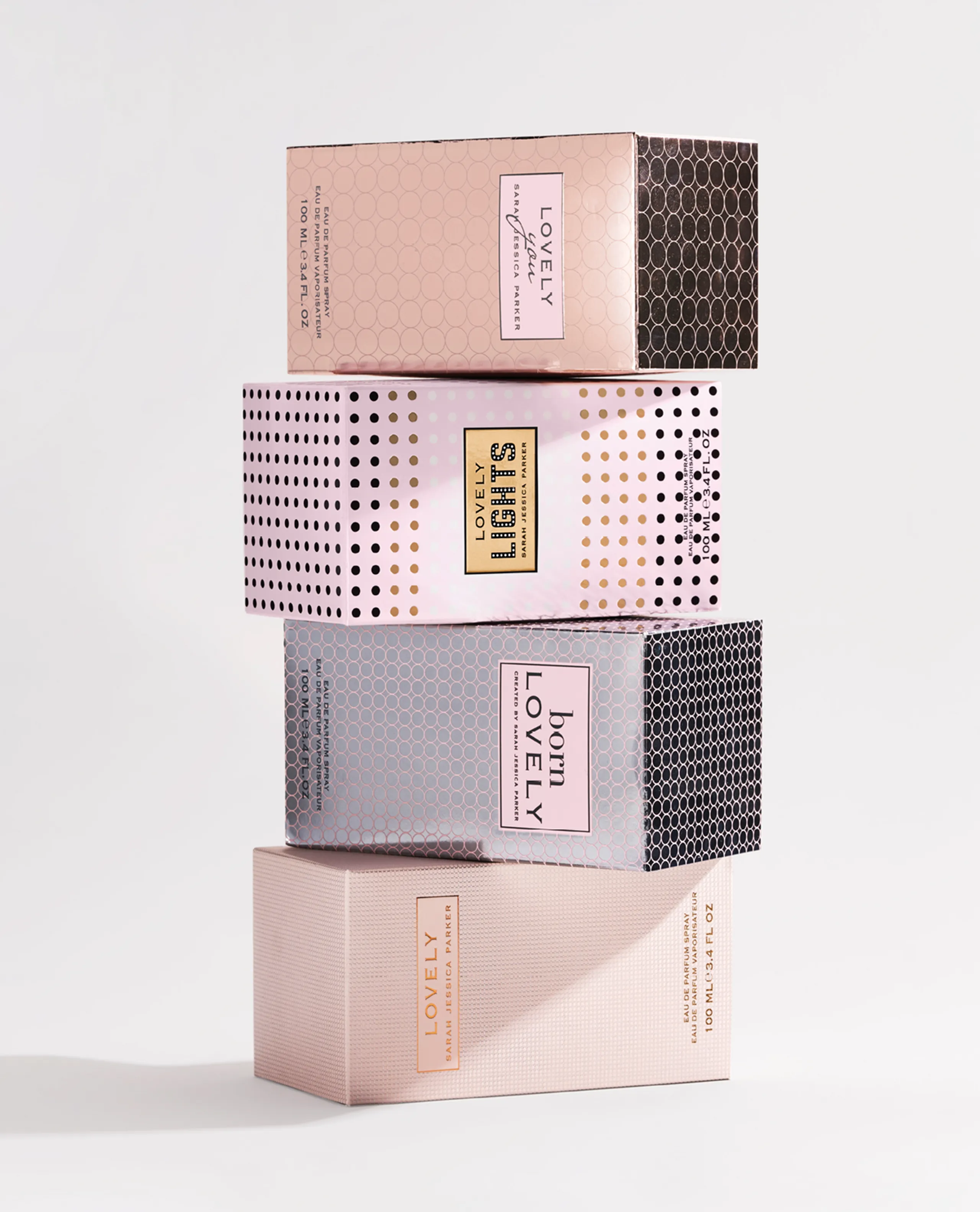
PACKAGING LOVELY LIGHTS
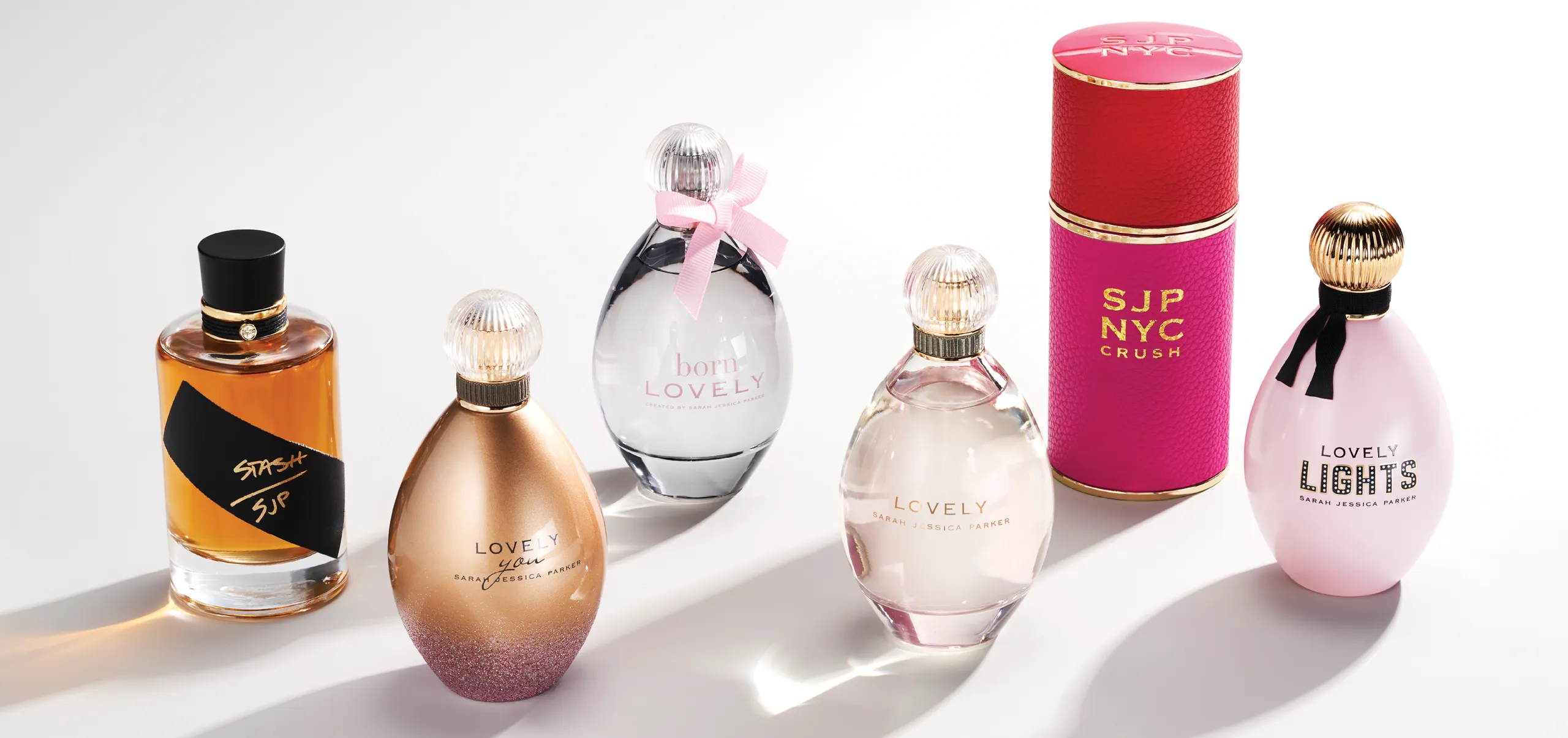
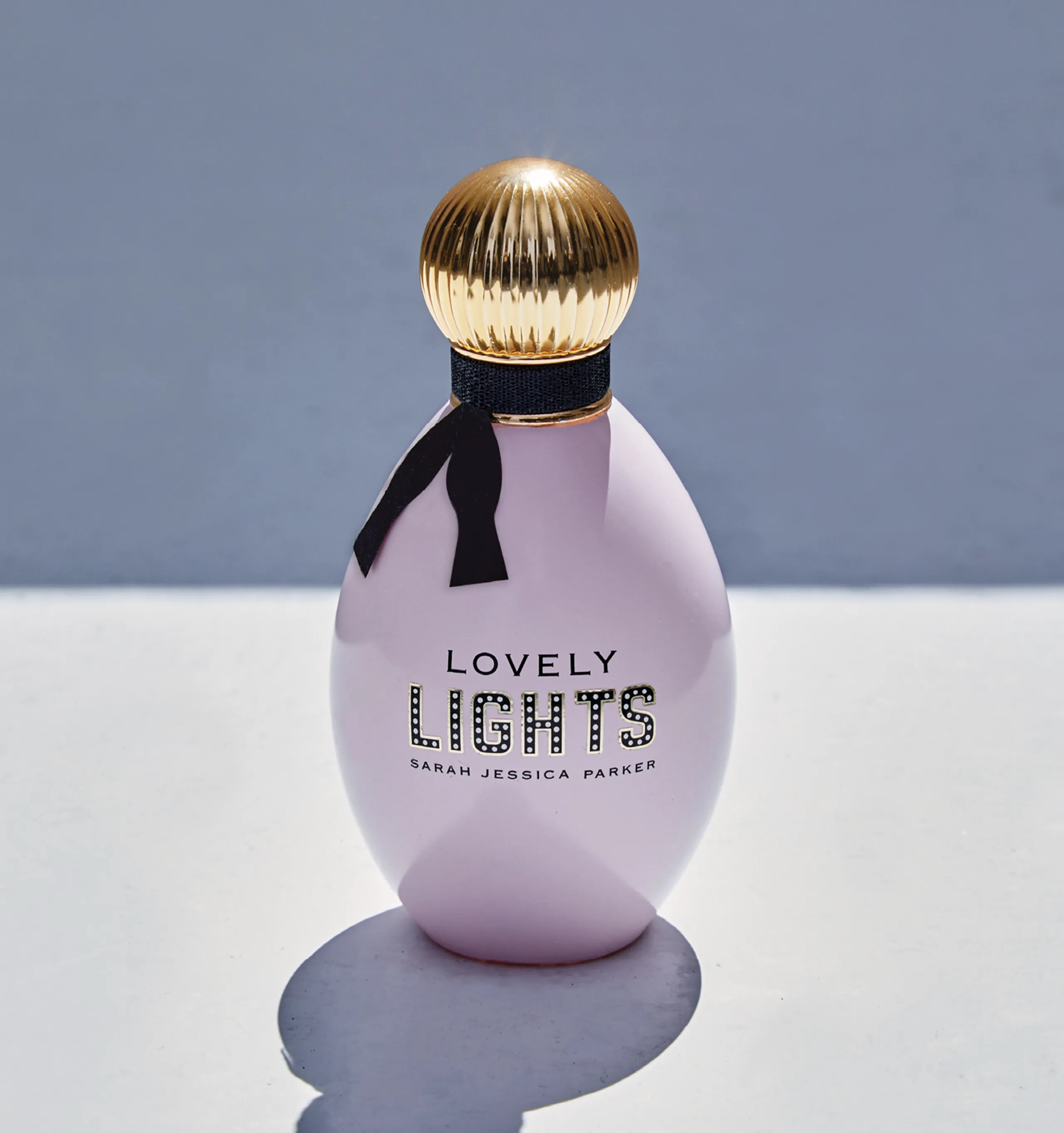
The newest member of The Lovely Collection, Lovely Lights, launched in 2022, and is inspired by the energy of NYC and the spirit of Broadway. The bottle dazzles with opaque creamy pink tones, bright lights enhancing the logo, a loosened bow tie collar and for the finale, an enchanting gold cap. All cues tie back to the original codes of Lovely.

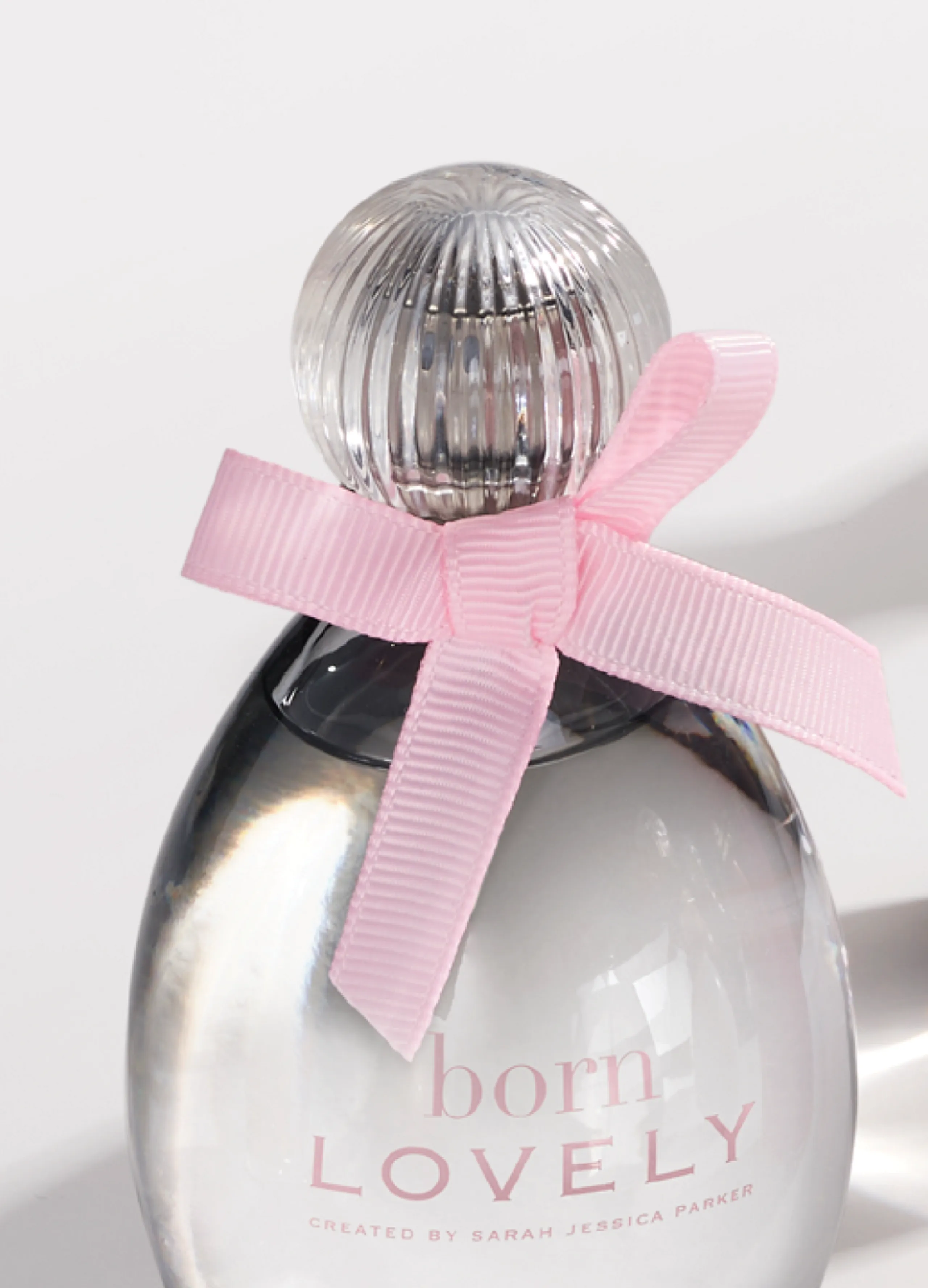
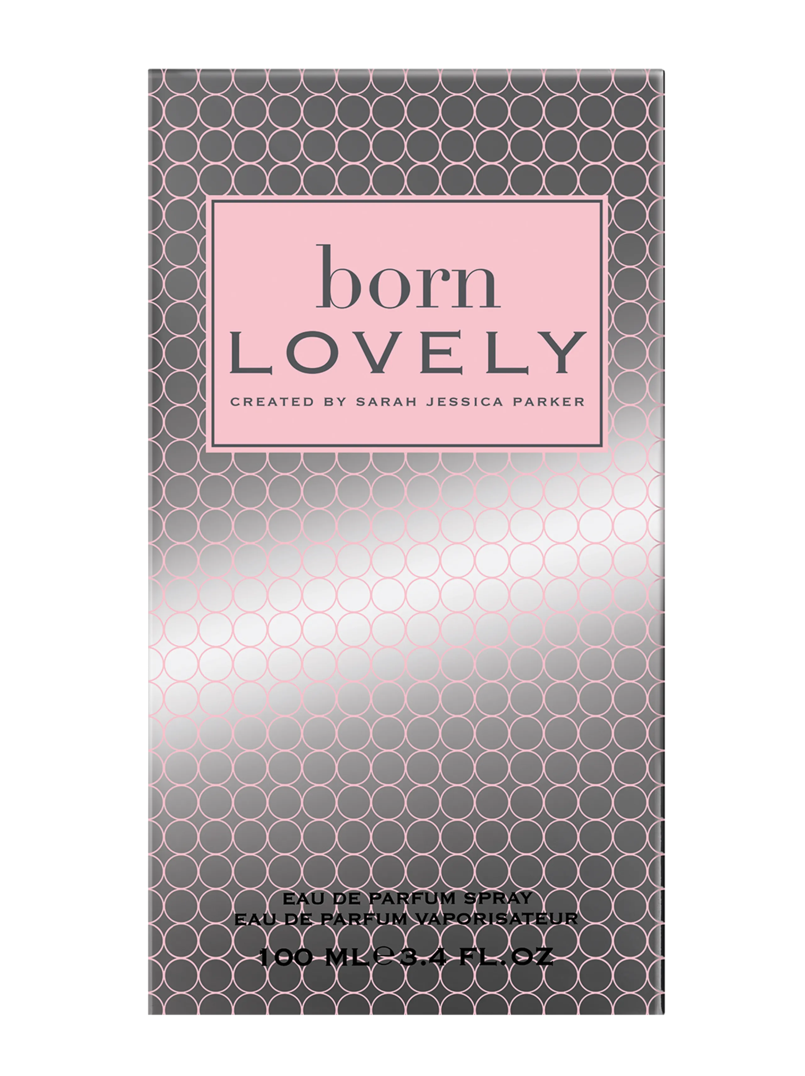
PACKAGING BORN LOVELY
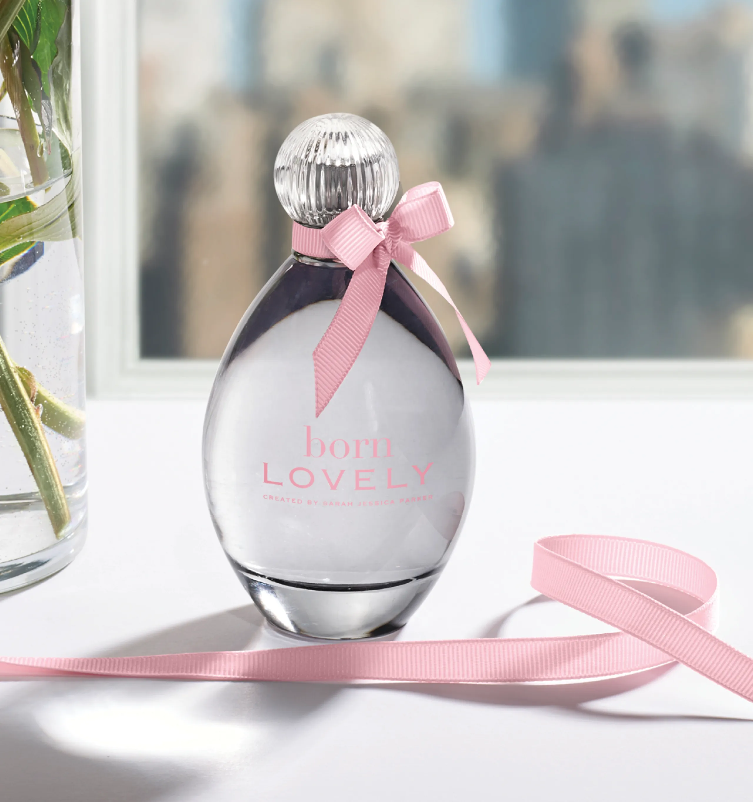
This first flanker and little sister to Lovely, Born Lovely came out in July 2018 as a new interpretation of the original Lovely fragrance. Born Lovely is a “celebration of inner beauty”. The bottle retains the same design codes of the original, but in reverse, with a youthful pink grosgrain bow and gray transparent glass.
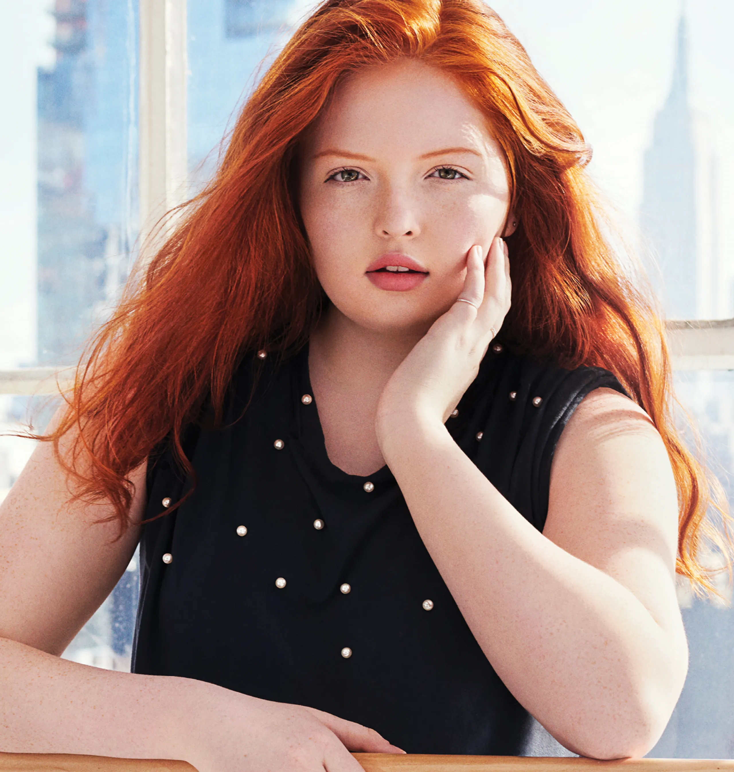

CAMPAIGN BORN LOVELY
In keeping with the original Lovely DNA with a twist, this next generation speaks to diversity and individualism and being comfortable in your own skin.


THE VISION STASH
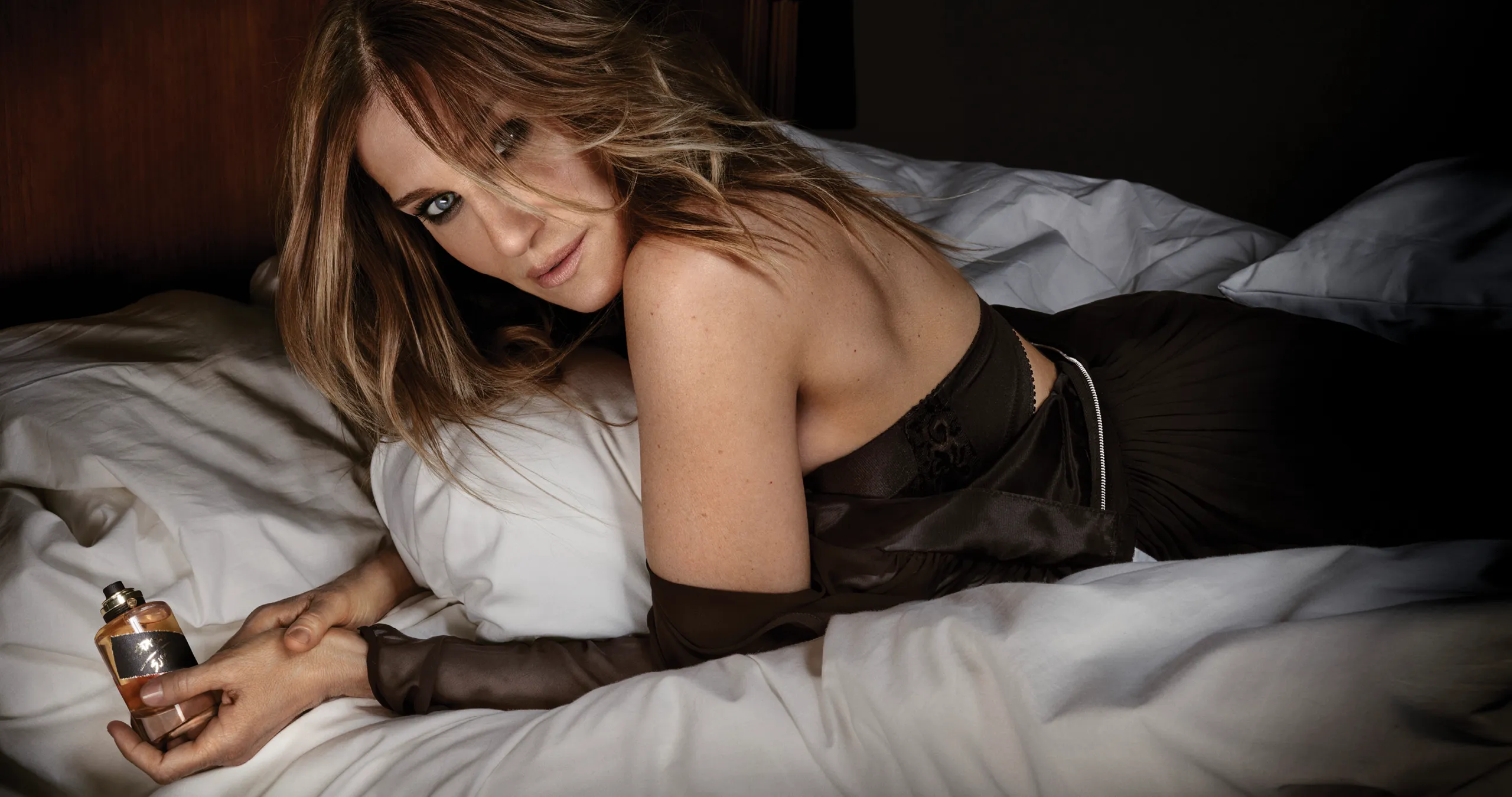
Fast forward 10 years from the original Lovely fragrance and we have taken the same developmental approach to Stash, just with very different codes. Consistent with all fragrance brands she’s launched, this project started with the fragrance itself. She had dabbled quietly over the years on developing and experimenting with it, so when it came time to actually work with IFF, she knew exactly what she wanted. Simultaneously, the name Stash SJP came to life. The fragrance was SJ’s secret “stash” for all this time and now she was ready to share it with the world.


PACKAGING STASH
We were inspired by something authentic, mysterious, secretive,
apothecary or old fashioned—hand made. We knew it would be a dark
cognac color. We looked back and researched perfumes and oils from
decades ago and was intrigued by the rawness and simplicity of the
packaging, but still focusing on handcrafted details and craftsmanship.
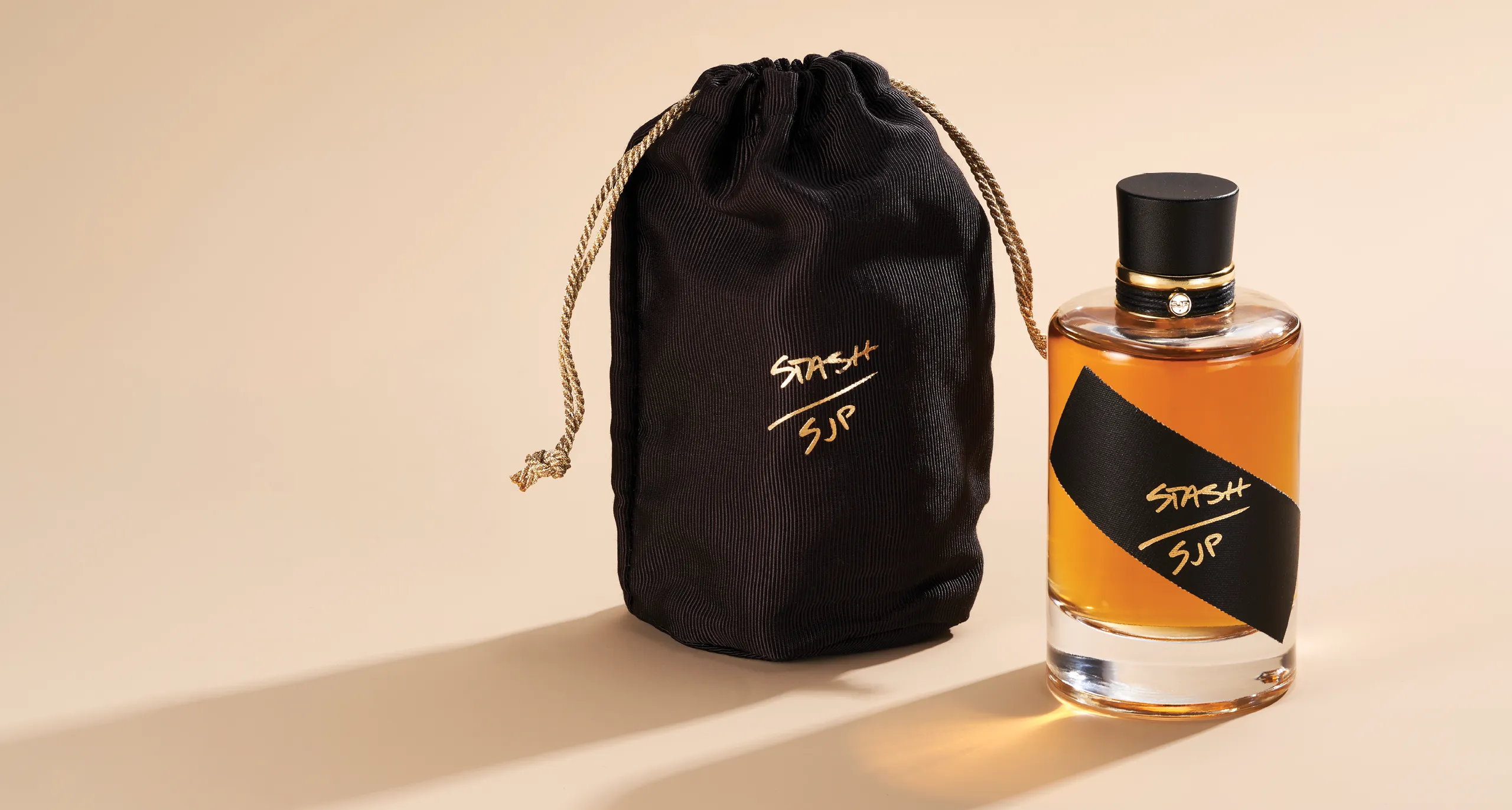
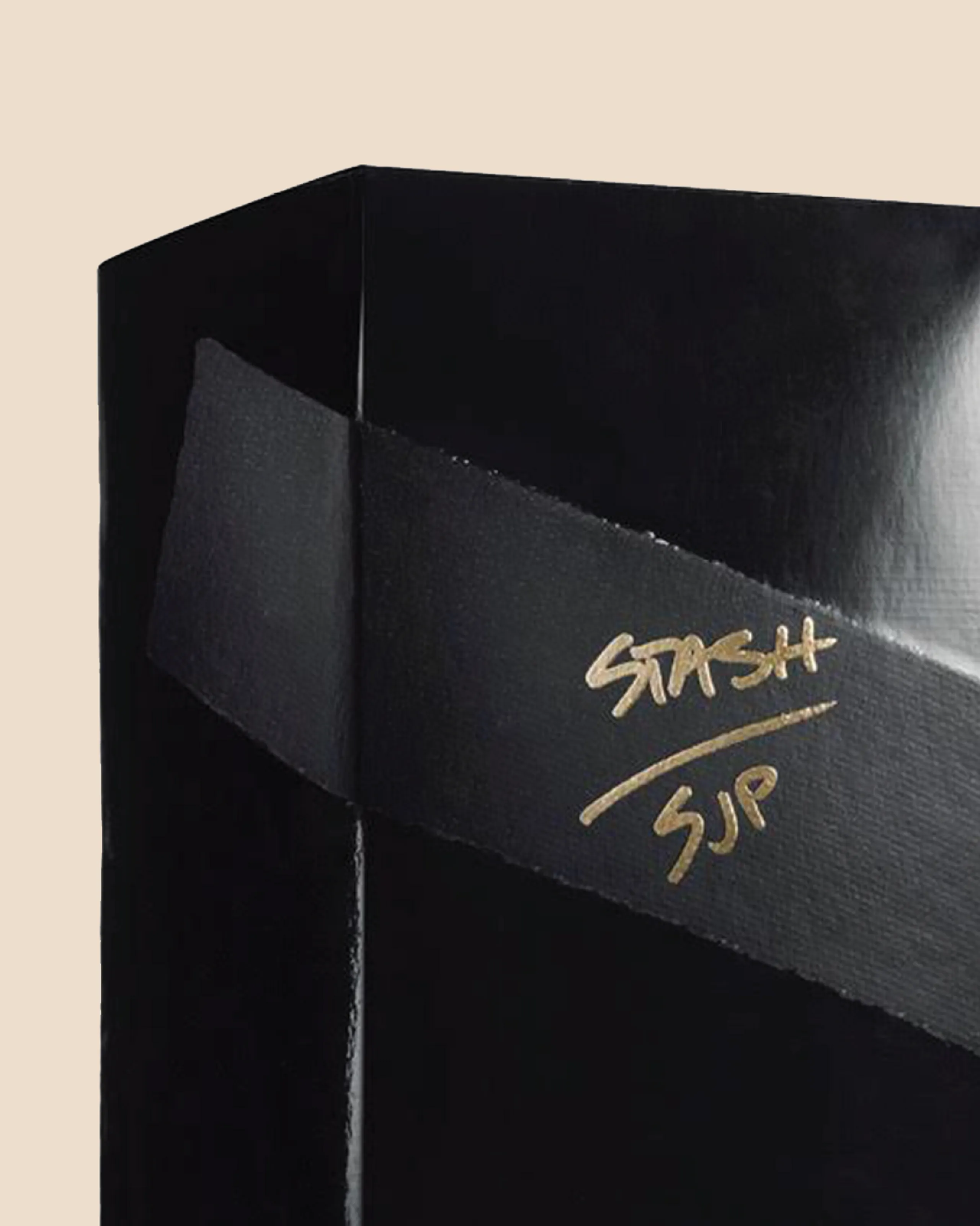
We loved the idea that it was packaged right from the lab in the glass and materials they had there. It’s the moment she was in the lab finalizing the scent and grabbed the vial, poured the juice in, corked the top, ripped a piece of tape and feverishly signed—Stash SJP! That’s it. This is how the packaging concept was born.
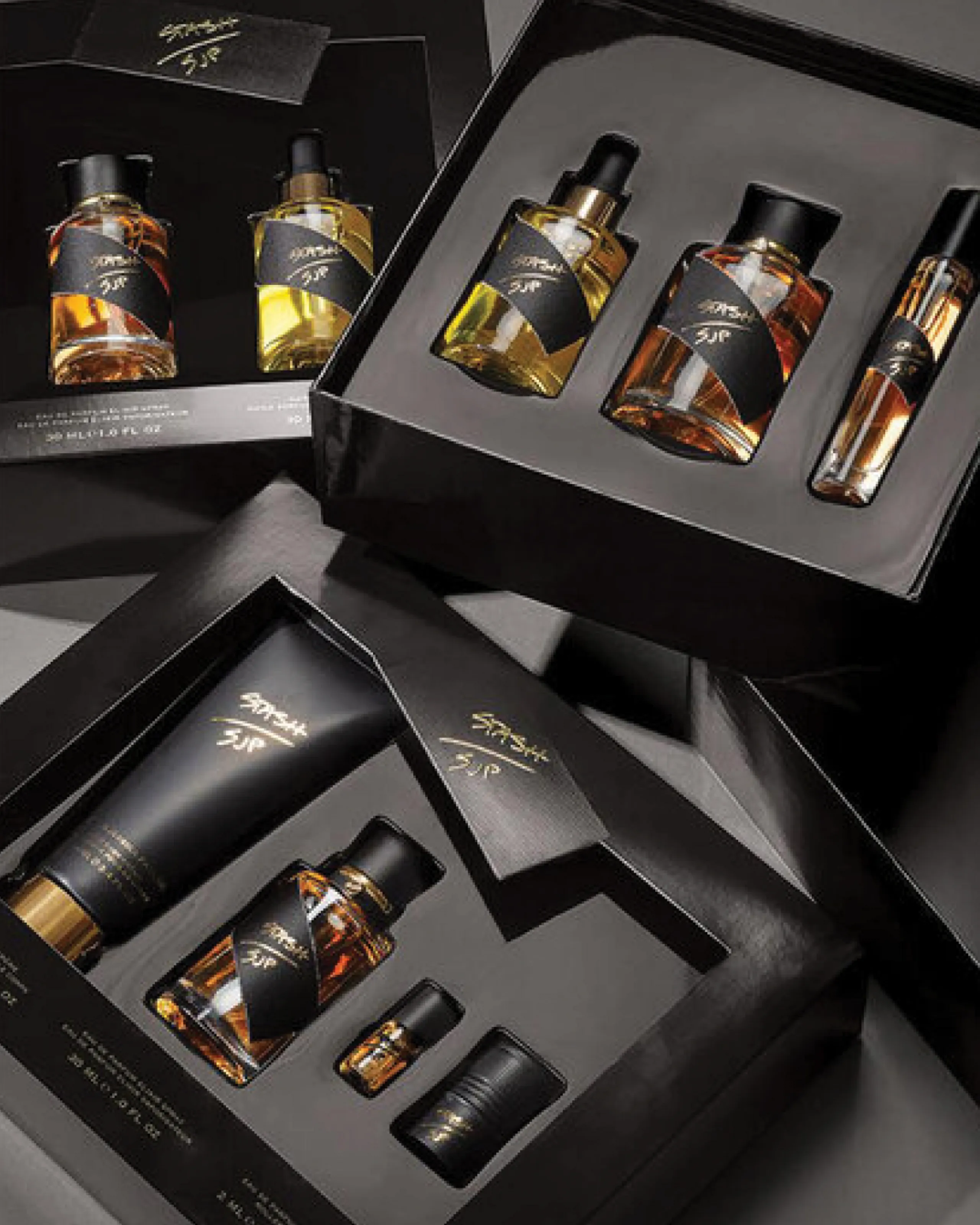
We started with the glass. We were very much into this laboratory/vial style glass, but were highly conscious of the price point and making sure the consumer got the value she (or he) deserved. By staying with a simple cylindrical shape, we added a heavyweight curved shape to the heel of the glass. This qualitative detail sharply contrasted the simple shape of the outside perfectly. The cap was inspired by the shape and function of an old fashioned cork. We actually explored using a real cork material, but it didn’t feel upscale enough. So instead we modeled the matte black cap shape from a cork stopper. Adding the hand tied matte cord and signature gold SJP emblem around the gold collar completed the look. The combination of these materials feels authentic—slightly vintage yet understated.

