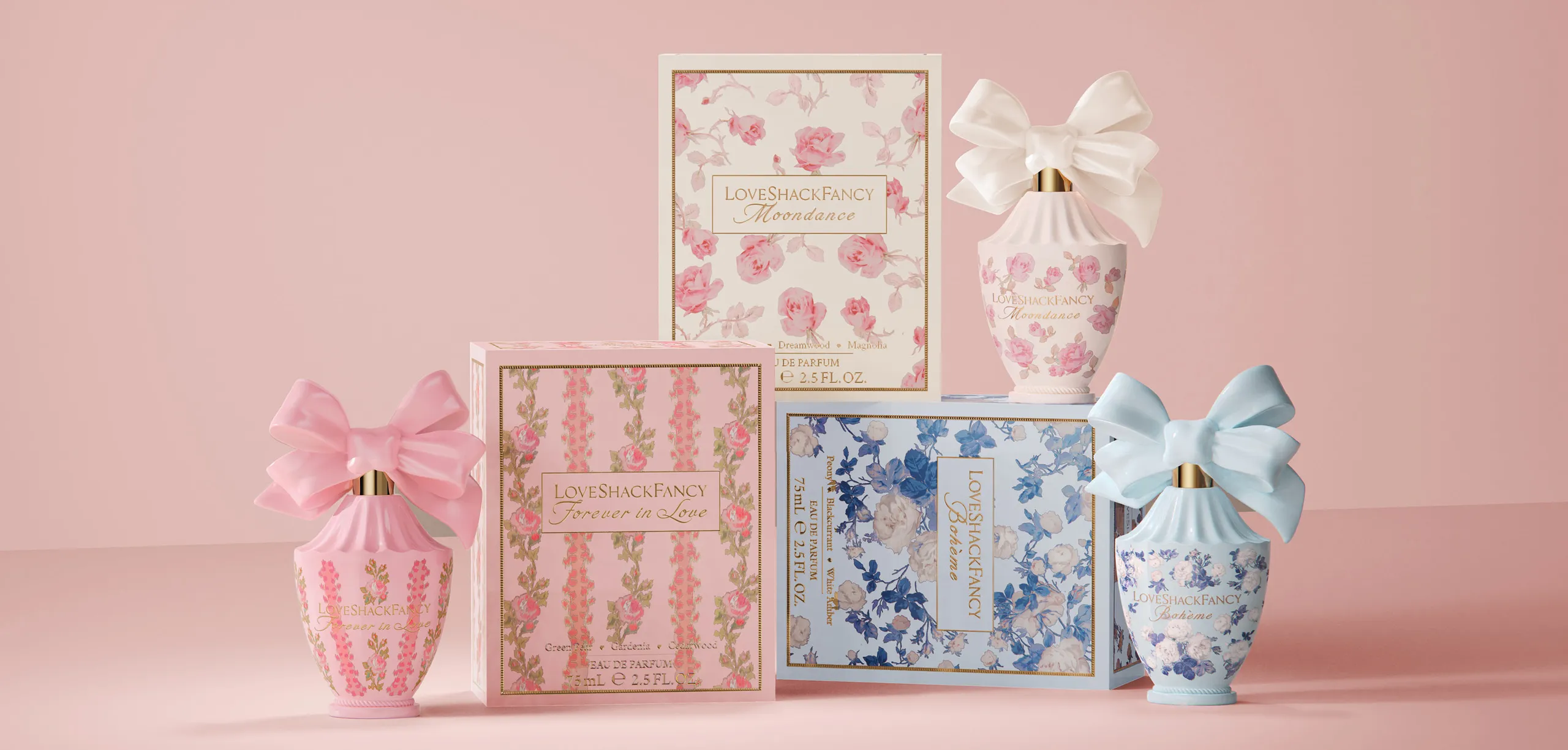
LOVE SHACK FANCY
Love Shack Fancy was looking to expand their fashion brand into the
beauty territory and came to us with an ask to create a collection of
three fragrances that are a reflection of the brand’s uber-feminine
aesthetic. To debut this timeless brand’s fragrance, we looked to the
core of where the brand lives and breaths.
- Packaging
- Art Direction
THE VISION
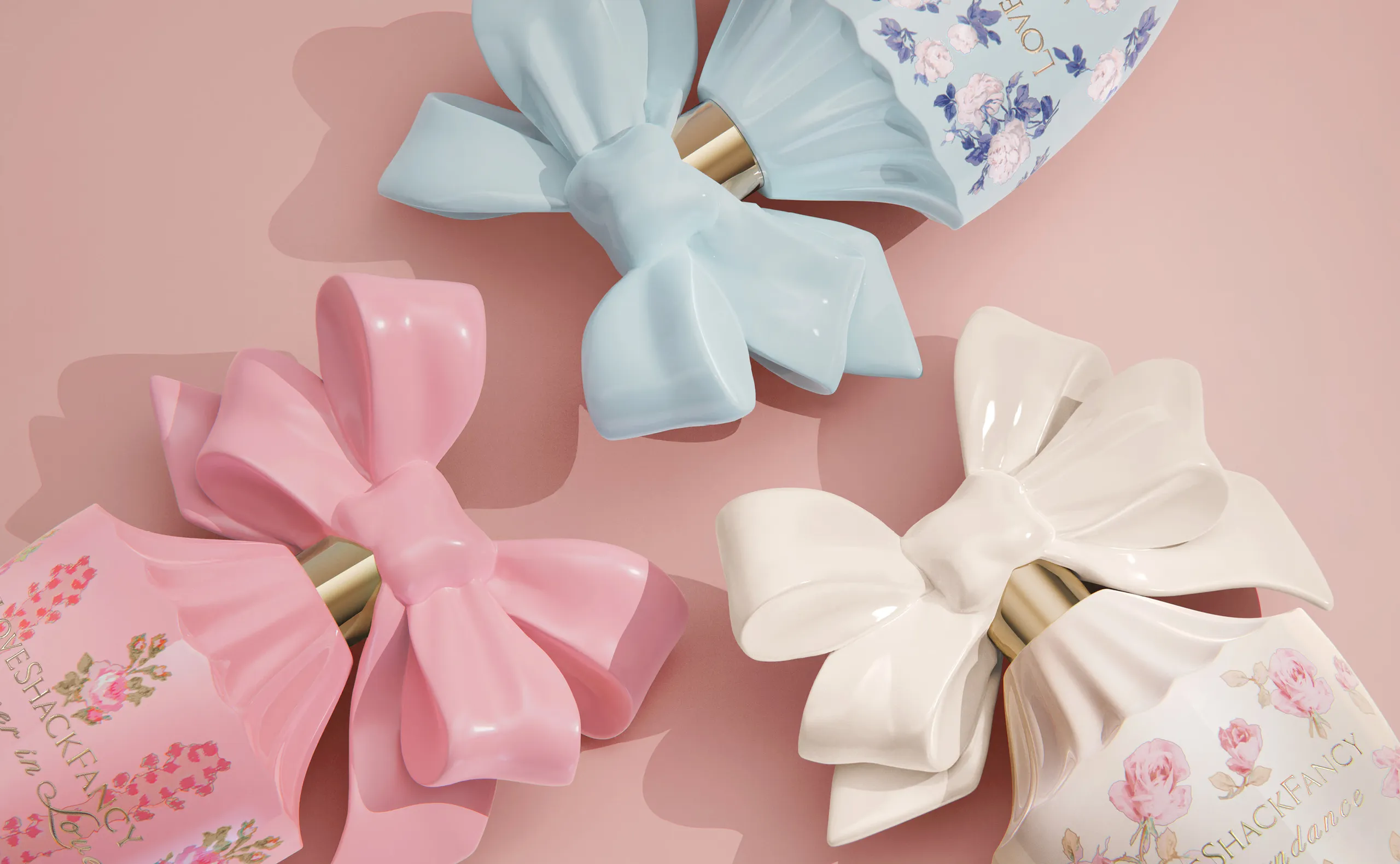
After immersing ourselves and digging through the brand’s DNA,
we made some very important discoveries. Floral patterns, oversized
bows, luxe fabrics, and nods to vintage Parisian decor were amongst
the core of the brand. With that, we designed a bottle that would fit
perfectly into their world.
PACKAGING
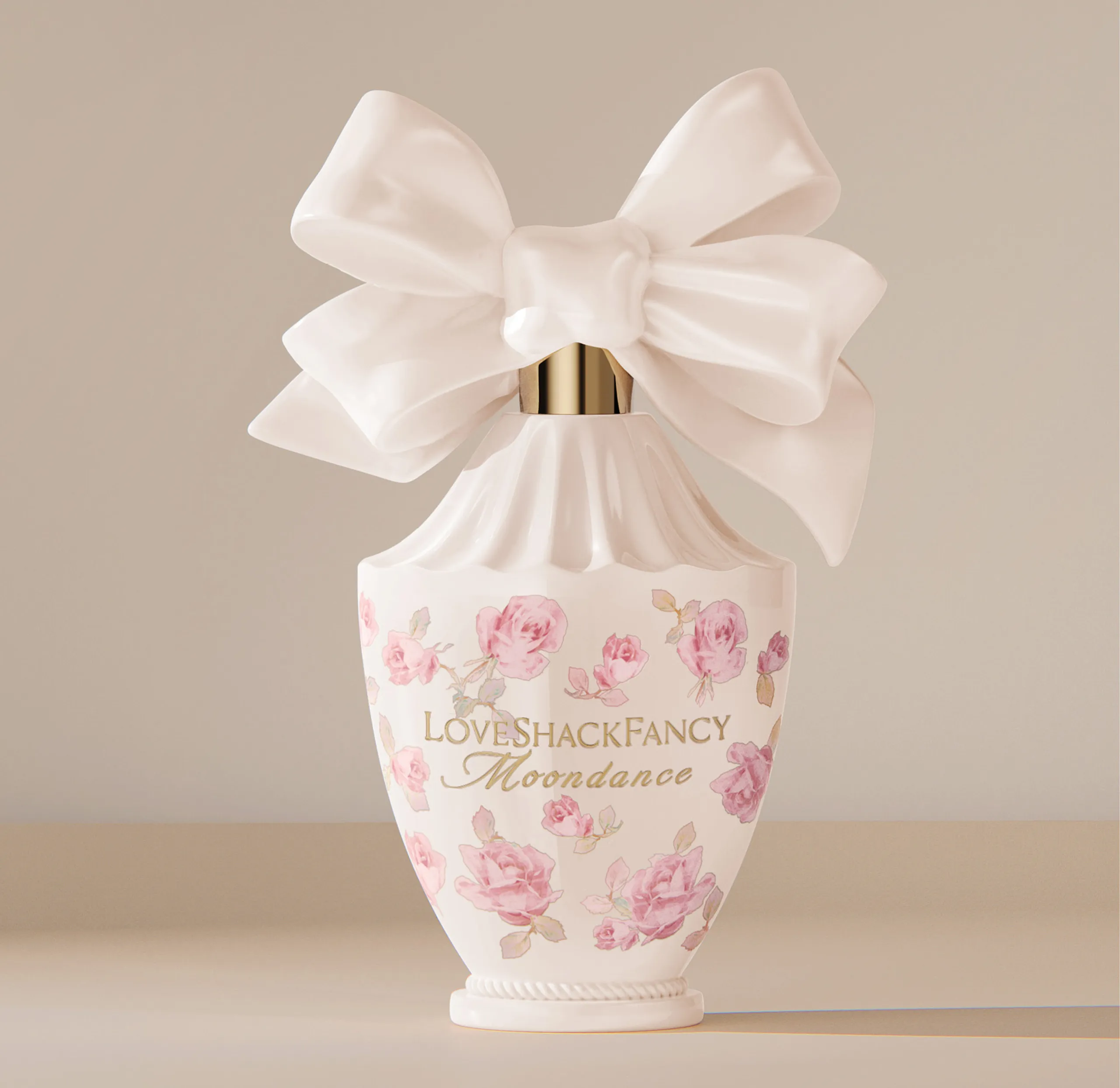
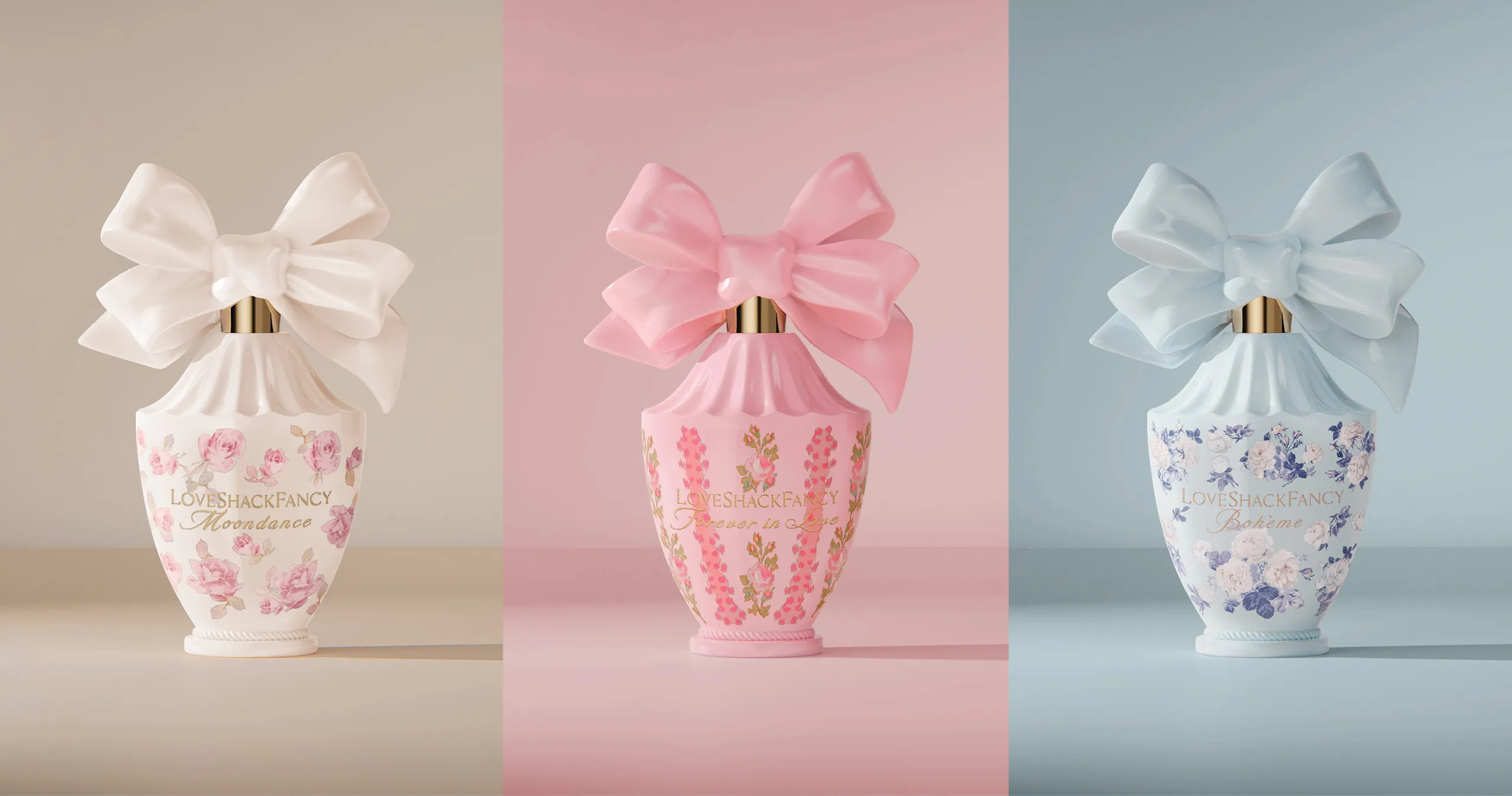
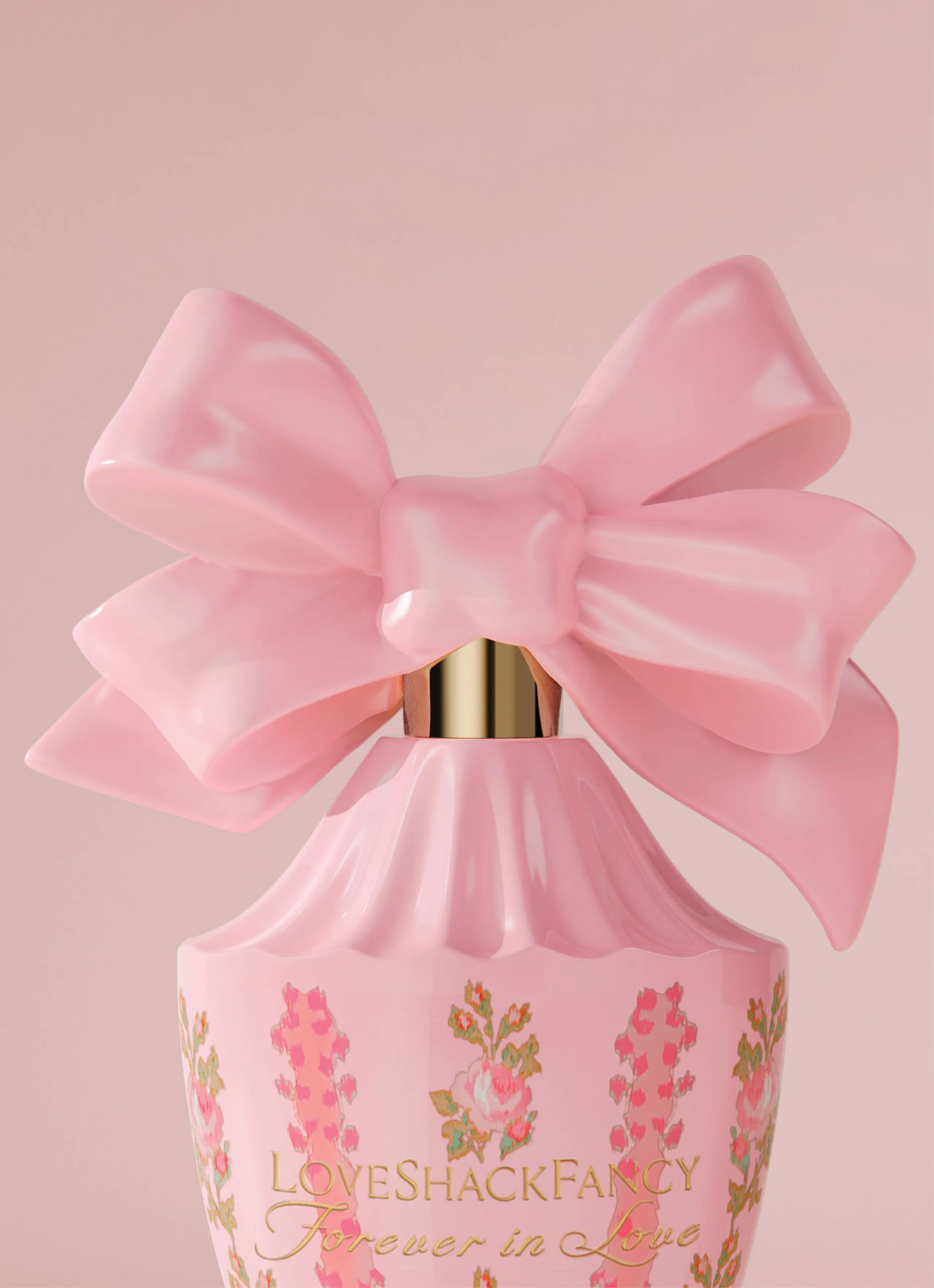
At the precipice of the flacon sits an oversized perfectly imperfect bow as a
nod to the founder’s lifelong love of ribbons. Ever so girly and surprisingly
fresh, this large bow cap is a show stopper that was meticulously drawn
and brought to life to look like it was tied and tightened by hand. The
luxurious shiny gold collar holds this bow up like a treasure to behold.
The vessel is a nod to fashion with the top scallops curved and sculpted to mimic a pool of fabric from an extravagant LoveShackFancy gown. The bottle continues with a dainty curve meeting at the bottom and then gathered with a ring of ropes inspired by lavish baroque architecture, creating an air of sophistication and strength. All this beauty sits atop a pedestal and harks back to a flacon found in a vintage shop in the heart of Paris. Each bottle is then finished in soft washes of color that evoke scent more subtly and tie back into each piece of the brand’s name. Love=Pink, Shack=Blue, Fancy=Cream.
The vessel is a nod to fashion with the top scallops curved and sculpted to mimic a pool of fabric from an extravagant LoveShackFancy gown. The bottle continues with a dainty curve meeting at the bottom and then gathered with a ring of ropes inspired by lavish baroque architecture, creating an air of sophistication and strength. All this beauty sits atop a pedestal and harks back to a flacon found in a vintage shop in the heart of Paris. Each bottle is then finished in soft washes of color that evoke scent more subtly and tie back into each piece of the brand’s name. Love=Pink, Shack=Blue, Fancy=Cream.
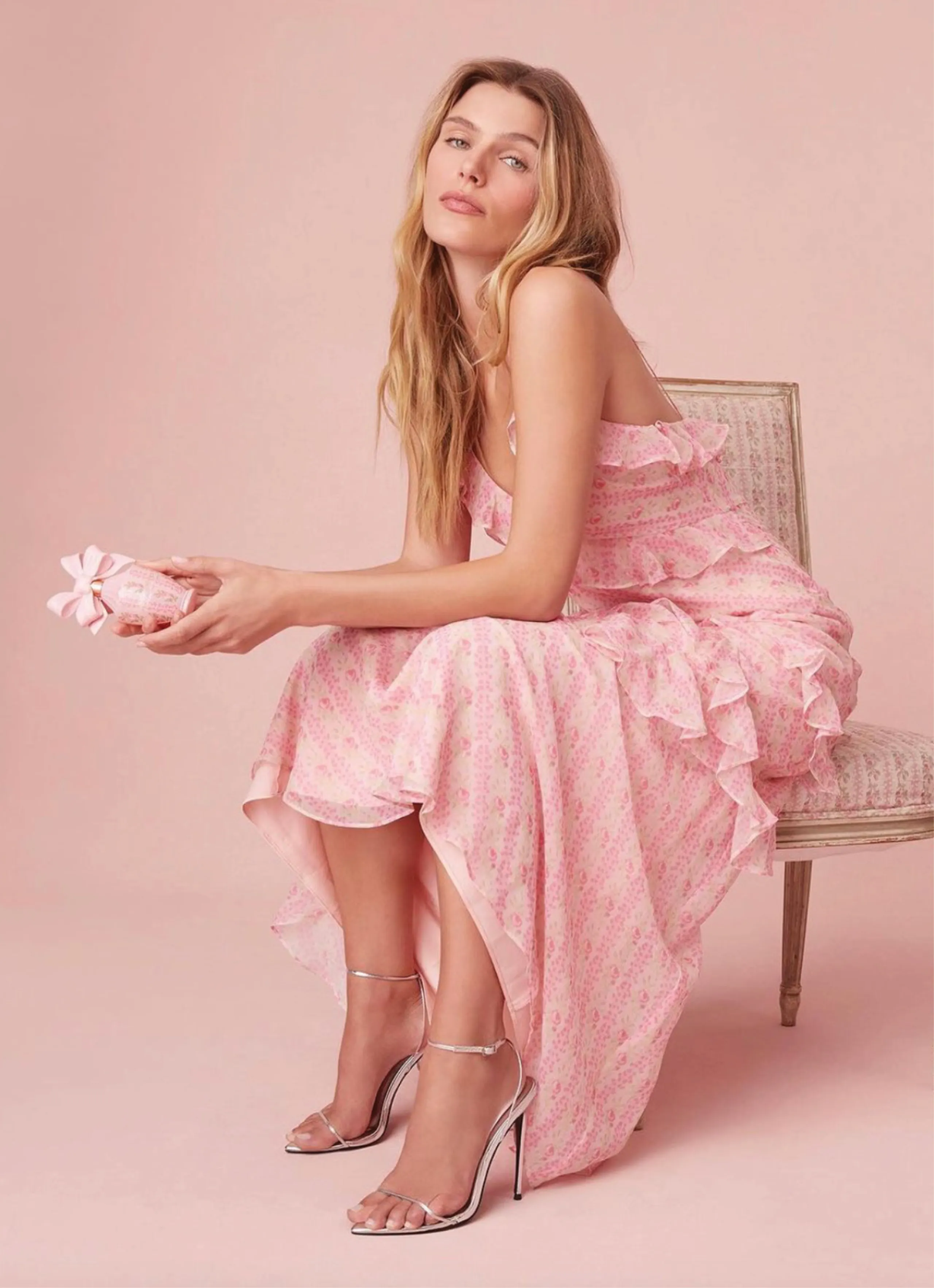
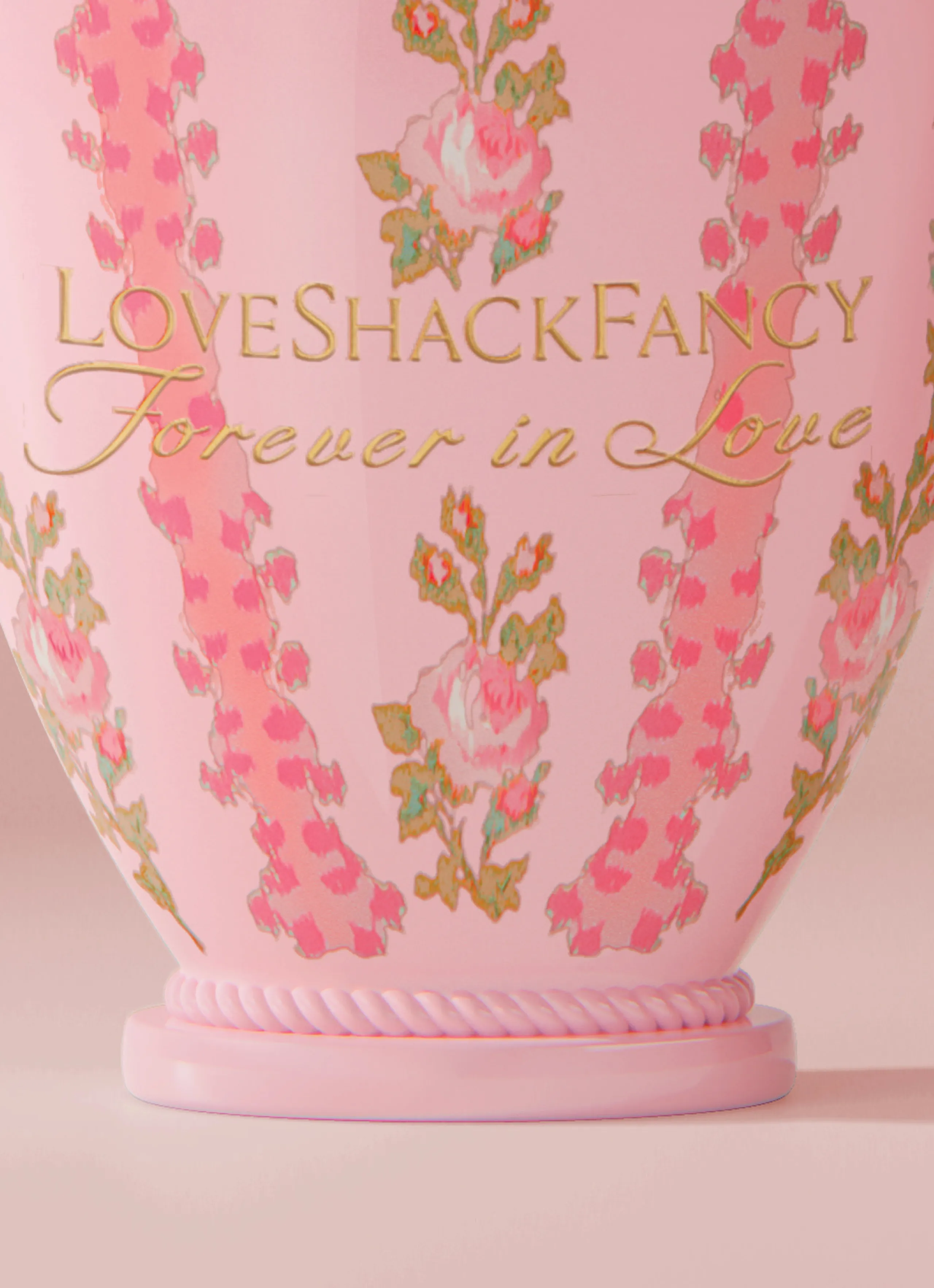
The intricately designed and placed patterns on the body of the glass were
made to inspire feelings of timeless nostalgia. The LoveShackFancy logo
and scent name complement each other with a strong bold serif font paired
with a curvy script, all decorated in a gold foil that shines and sparkles.
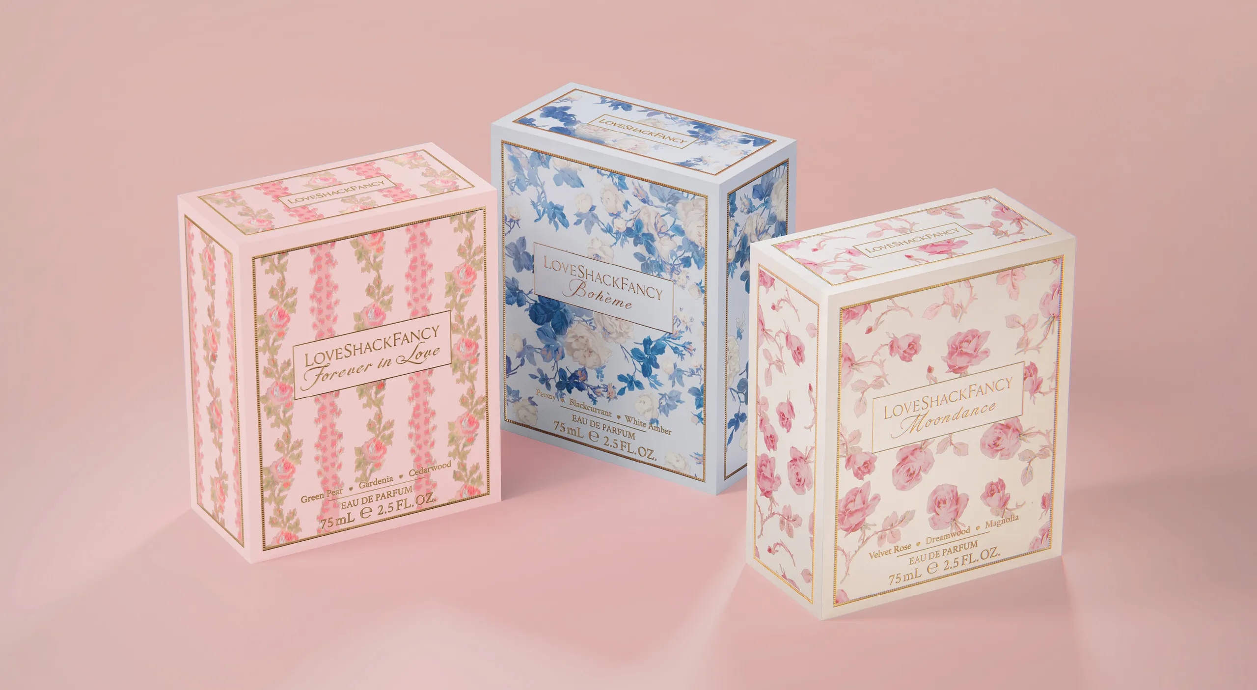
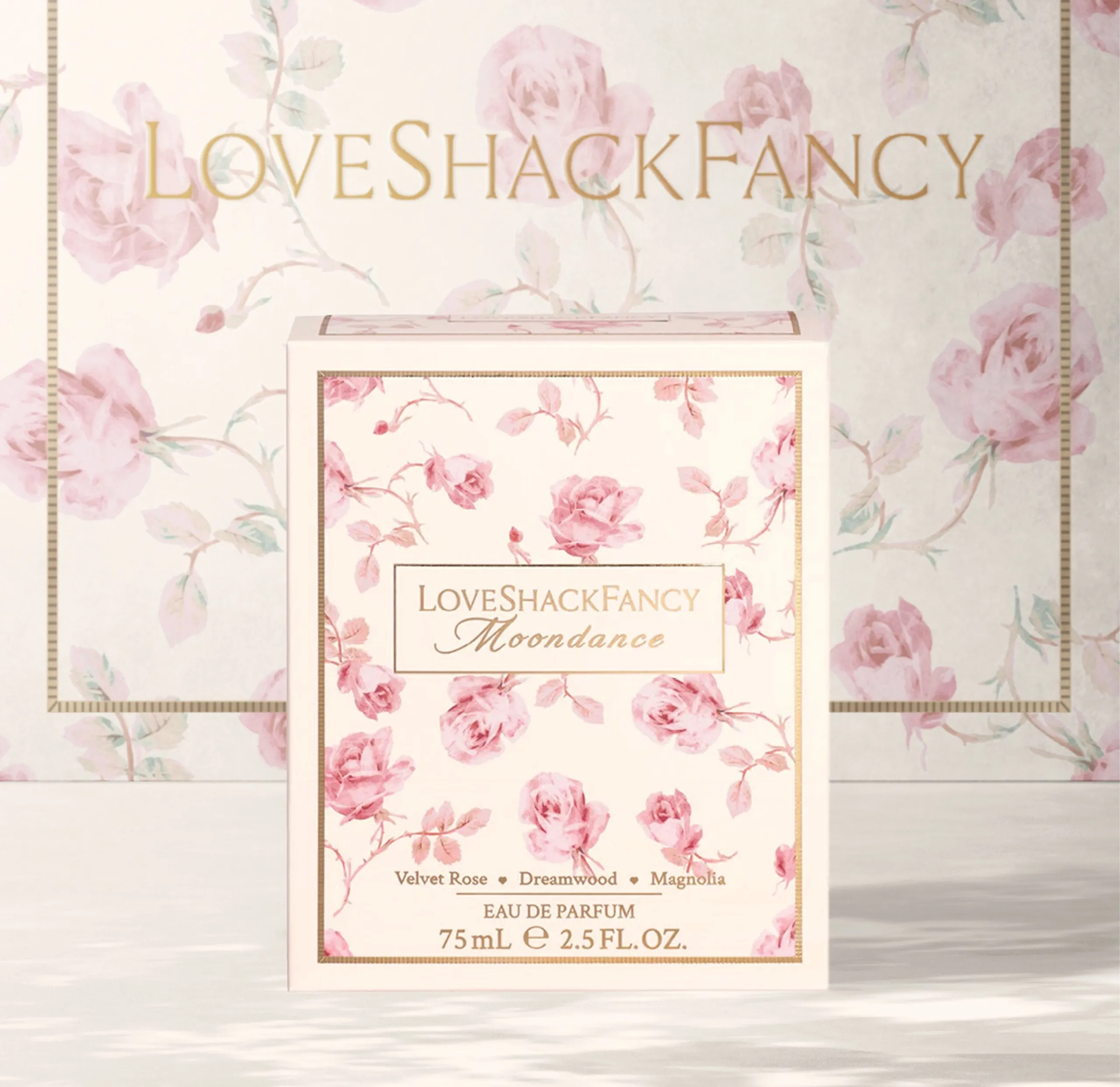
The bottle lives in a custom folding carton adorned with its respective
floral pattern contained in a grosgrain ribbon border in shiny luxurious
gold foil. In the middle of these floral patterns lives a simple gold plaque
with the logo and scent name embellished in gold foil to shine and stand
out. These elaborate patterns are placed on each panel of the carton,
except the back which has a tonal romance copy that brings light to the
contents that live inside.
